Pssst, can you read this?
Well, according to WCAG 2.2 you can.
Small bold and thin fonts are fair game too.
In short, today's contrast standards aren't without flaws.

The Accessible Perceptual Contrast Algorithm aims to change that.
Contrast
3 min. read
Product Designer:
Myself
Original Creator:
Alex Carr
Plugin Developer:
Ashot Pahlevanyan

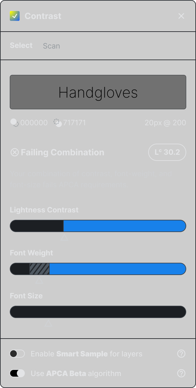
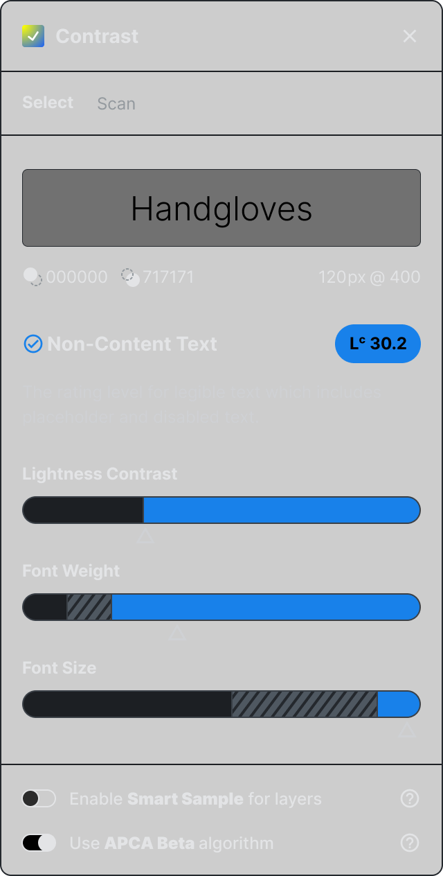
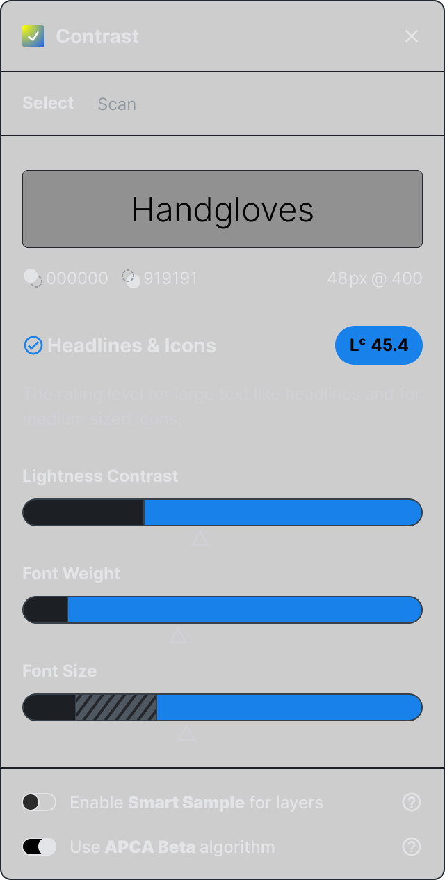
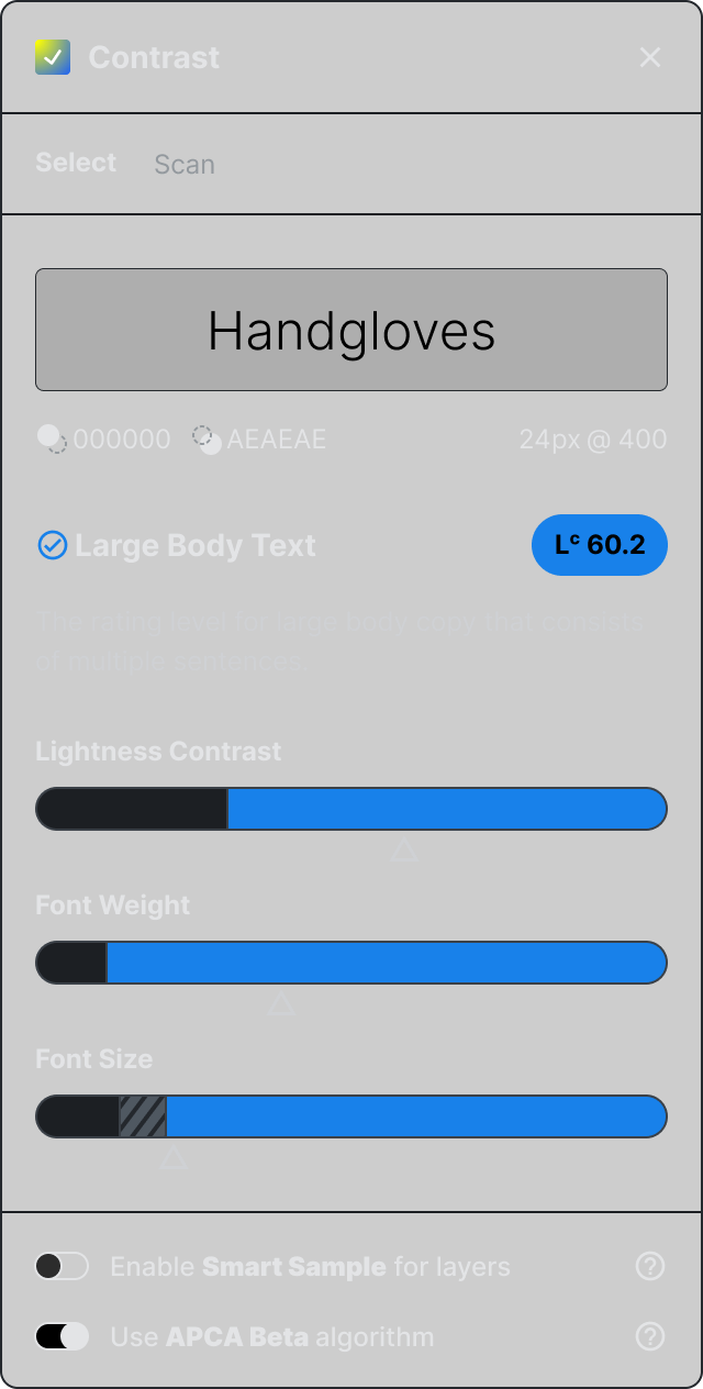
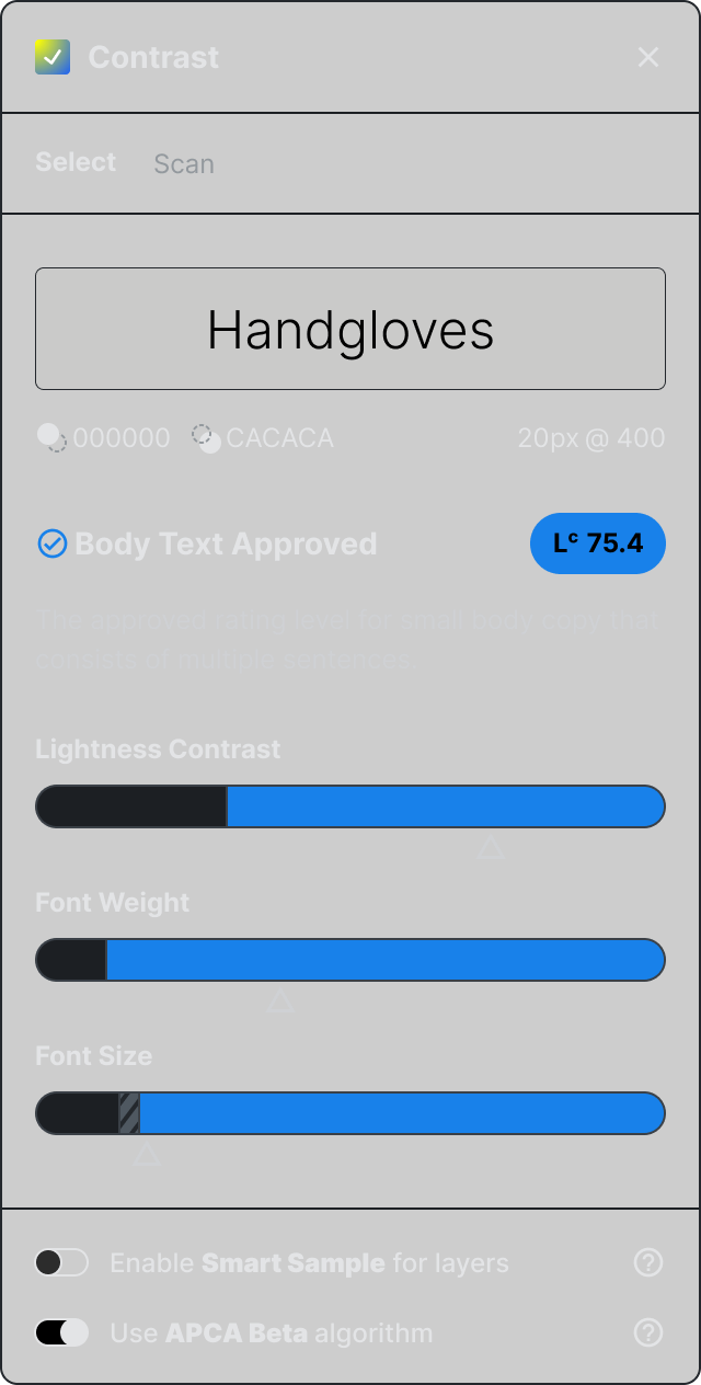
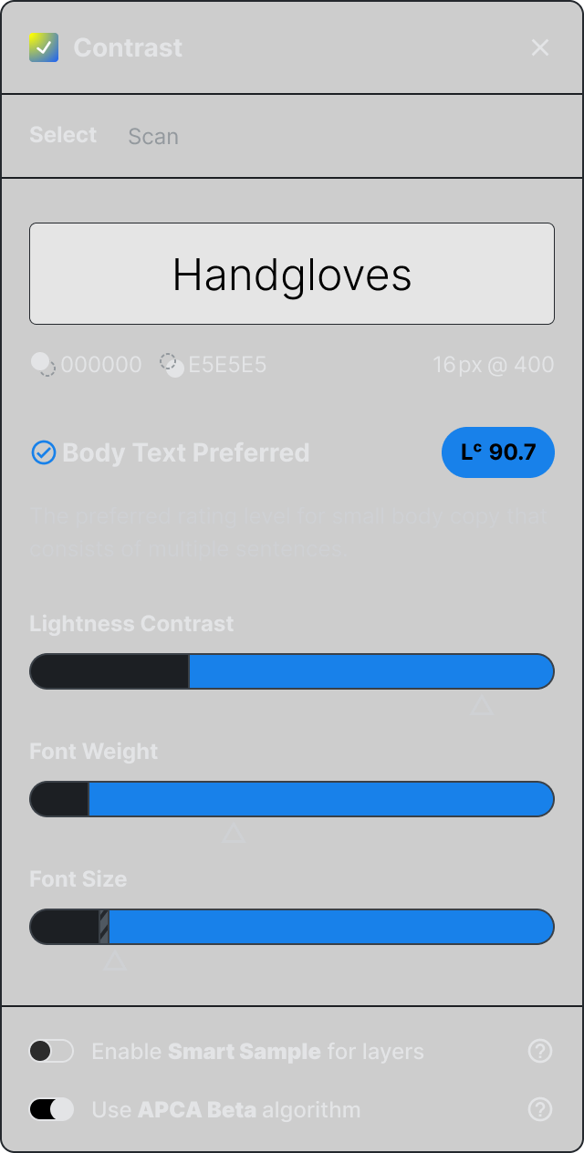
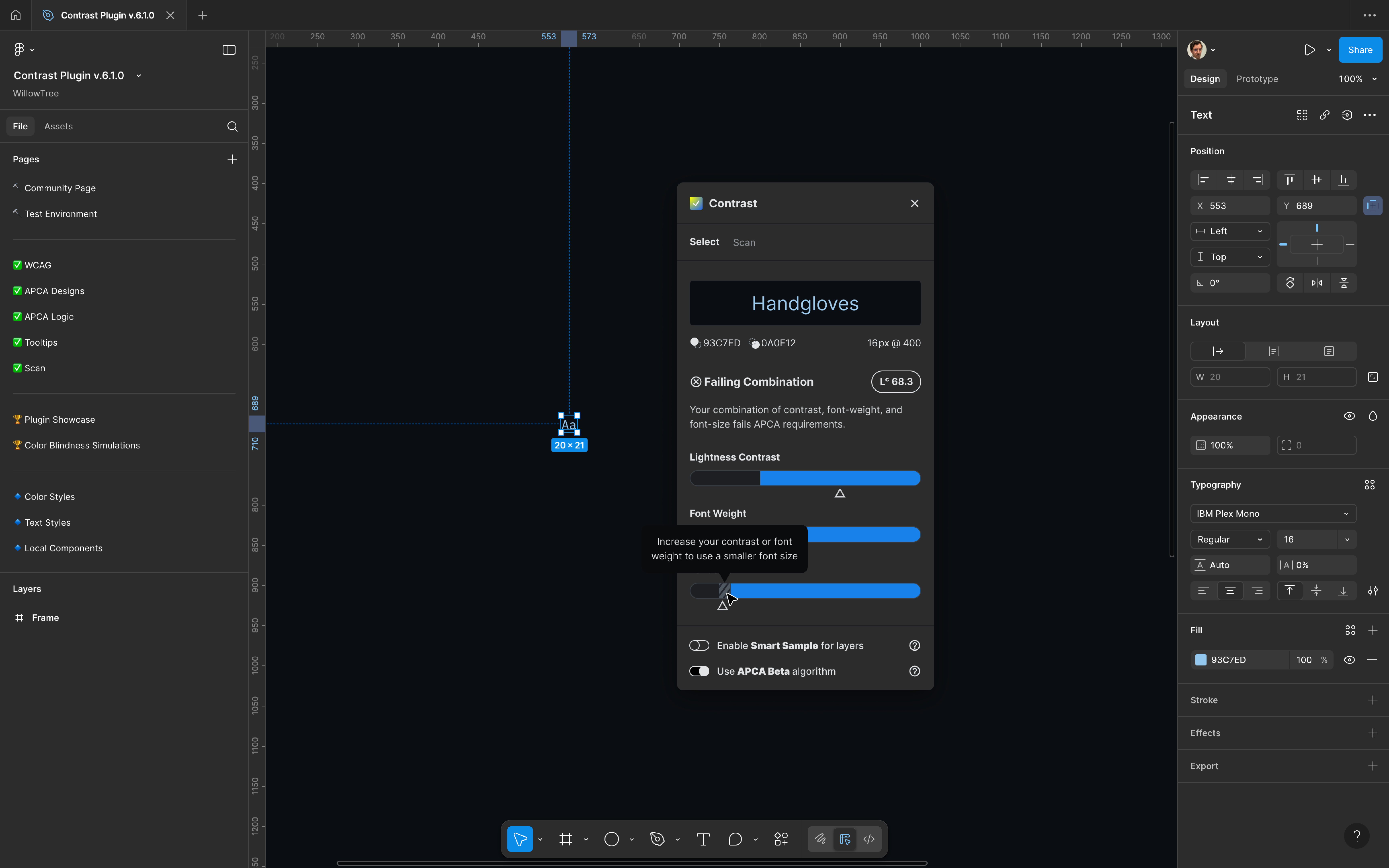
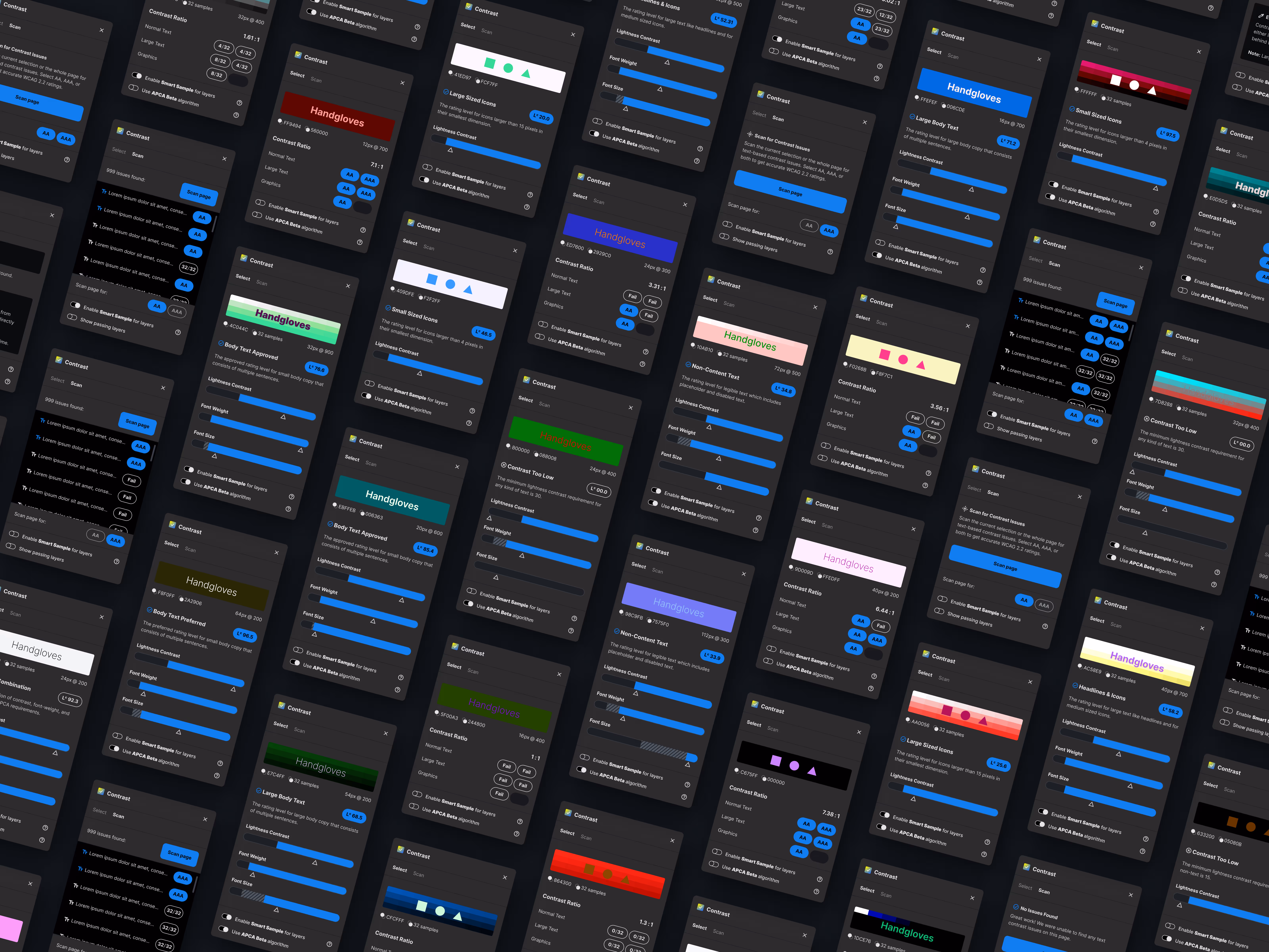
In the summer of 2023 I was given the opportunity to create the next version of the Contrast plugin by WillowTree's Head of Design, Alex Carr. The update integrated WCAG 3's proposed color contrast algorithm known as the APCA.

I dove into researching and understanding the differences between the current (and still live) WCAG 2.2 method vs the proposed APCA model. The research, design, & output became the topic of my second conference talk Demystifying the APCA.

Font-size minimums?
Yes, the APCA removes binary pass/fail and replaces it with font-size minimums based on your foreground color, background color, and font-weight. This approach adds a lot of complexity to today's contrast process and has a steep learning curve.

Instead of designers having to know just 3 to 1 and 4.5 to 1 they will have to check if the font-size is accessible for any color combination they use.
Here's an example of the font-size minimums for...
#94C9EF
on
#1C1F23
N/A
100
Thin
45px
200
Extra-Light
29px
300
Light
20.75px
400
Regular
18.5px
500
Medium
16.5px
600
Semi-Bold
15px
700
Bold
16px
800
Extra-Bold
18px
900
Black
Wait...what??
Even though #94C9EF on #1C1F23 has a contrast ratio of 10.72 to 1, the APCA dictates that the smallest font-size you can use is 15px but it has to be bold. And if you want to use regular font-weight, the minimum font-size increases to 20.75px.

All of this nuance and complexity begs the question. How do you create a plugin that distills this algorithm into something easy for designers to understand and use?
Context is King
As a designer, I strive to build tools that can be explained in 2 or 3 sentences. And so if I could say one thing to anyone that uses Contrast, I would say ‘Blue is good'.

Is your contrast too low?
Increase contrast until the triangle is in the blue range.

Is your font-weight too low?
Increase the weight until it's blue.

Is your font-size too small?
Bigger til it's blue.

That's the ideal but in a practical world, context is king. So if the user is confused there should be UX to help guide them. If they end up with the Failing Combination they can hover over the striped areas of the plugin for tooltips.
Beyond the Plugin
The weeks of researching the APCA led to two amazing opportunities. The first was being able to meet Andrew Somers who is the brain behind the APCA. I spoke to Andrew for nearly 2 hours about his journey creating the algorithm and was even able to share my research with him. He was even kind enough to invite me to post to his github repo.

The other opportunity was speaking at axe-con which is the accessibility conference hosted by deque. Demystifying the APCA is focused on the differences between WCAG 2.2 & APCA and goes deeper into what it means for the size of your text.
Good design
respects the user.
Asking you to scroll, pinch, and zoom on every image throughout my portfolio on your phone would be a nightmare. In order to get the best experience please view this website on a laptop or larger.
Airdrop / Share
APCA
Dolor purus non enim praese
Pellentesque massa placerat duis ultricies lacus sed turpis tincidunt`
Imperdiet nulla malesuada pellentesque elit eget gravida cum sociis natoque. Sed viverra ipsum nunc aliquet. Nam libero justo laoreet sit. Nunc pulvinar sapien et ligula ullamcorper malesuada. Urna cursus eget nunc scelerisque viverra mauris in aliquam sem. Augue neque gravida in fermentum et sollicitudin ac orci phasellus.

Parturient montes nascetur ridiculus mus mauris. Nec ullamcorper sit amet risus nullam eget. Et netus et malesuada fames ac turpis egestas. Aliquet nec ullamcorper sit amet. Sapien et ligula ullamcorper malesuada. Lorem ipsum dolor sit amet consectetur. Mauris pellentesque pulvinar pellentesque habitant morbi tristique senectus.
Aliquam eleifend mi in nulla posuere sollicitudin aliquam ultrices sagittis. Vel fringilla est ullamcorper eget nulla facilisi.
WCAG 2
Dolor purus non enim praese
Pellentesque massa placerat duis ultricies lacus sed turpis tincidunt`
Imperdiet nulla malesuada pellentesque elit eget gravida cum sociis natoque. Sed viverra ipsum nunc aliquet. Nam libero justo laoreet sit. Nunc pulvinar sapien et ligula ullamcorper malesuada. Urna cursus eget nunc scelerisque viverra mauris in aliquam sem. Augue neque gravida in fermentum et sollicitudin ac orci phasellus.

Parturient montes nascetur ridiculus mus mauris. Nec ullamcorper sit amet risus nullam eget. Et netus et malesuada fames ac turpis egestas. Aliquet nec ullamcorper sit amet. Sapien et ligula ullamcorper malesuada. Lorem ipsum dolor sit amet consectetur. Mauris pellentesque pulvinar pellentesque habitant morbi tristique senectus.
Aliquam eleifend mi in nulla posuere sollicitudin aliquam ultrices sagittis. Vel fringilla est ullamcorper eget nulla facilisi.